Case study
Rebranding
Stationery design
A12 Project
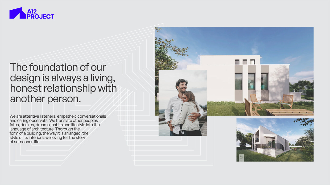
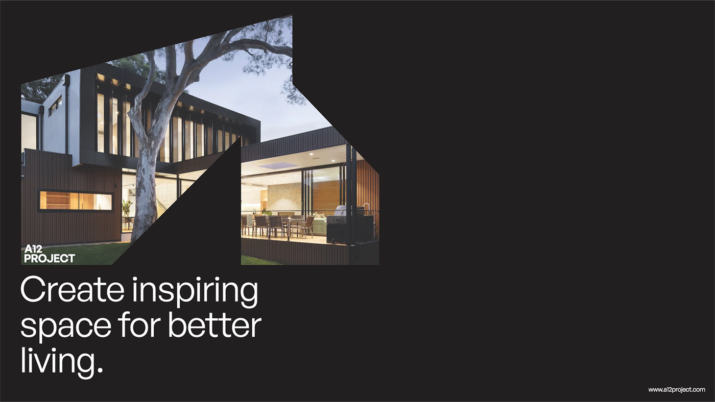
A12 Project is one of the Montenegro leading architecture firms, recognized for an includes iconic buildings and modern approach. Based in Podgorica, Montenegro, the practice brings together partner-led interdisciplinary teams of architects, designers, and technical experts to create sustainable and inspiring buildings and environments that transform communities in Montenegro and surroundings.
Logo has designed a vibrant new identity for A12 Project that captures its innovative spirit and contemporary ethos. VB-S team worked closely with all A12 Project to evolve the firm’s communications.
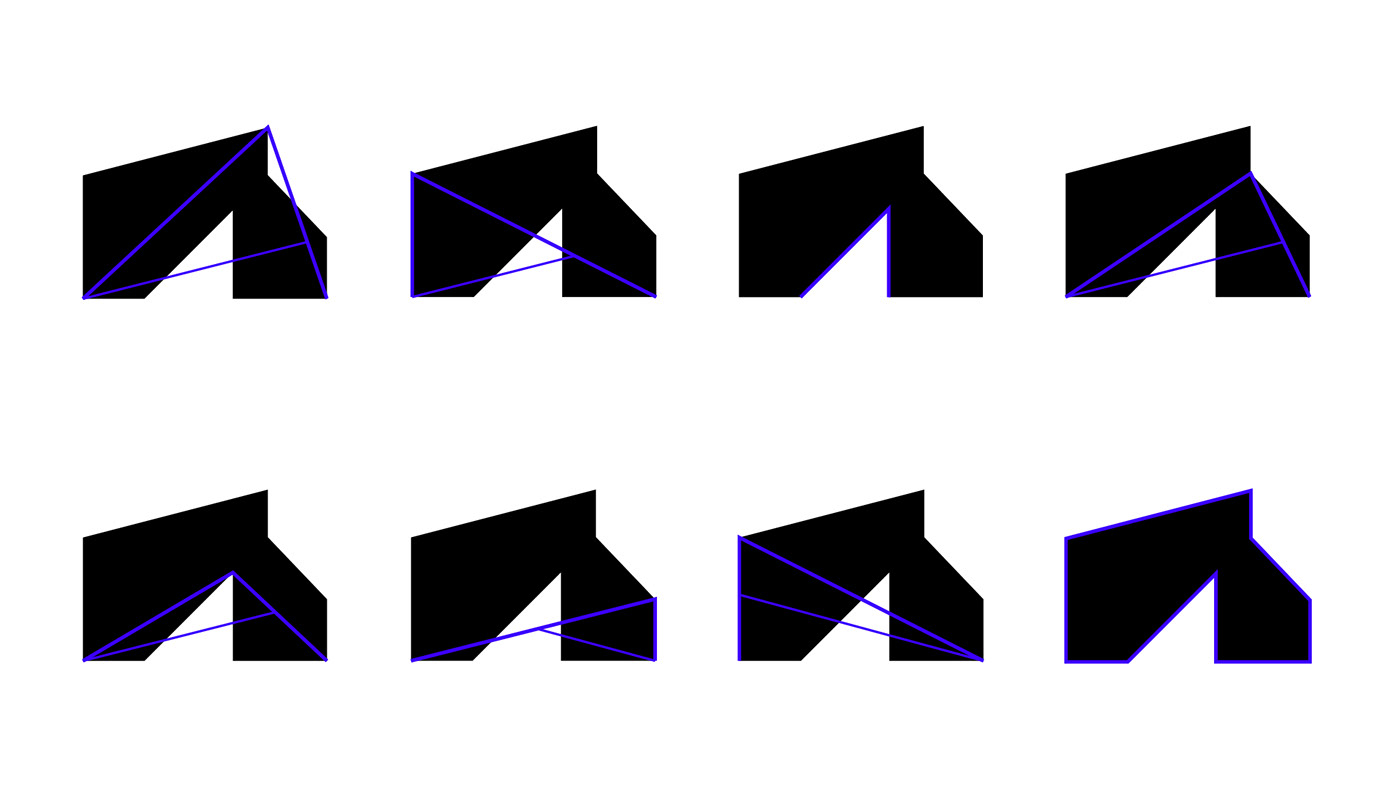
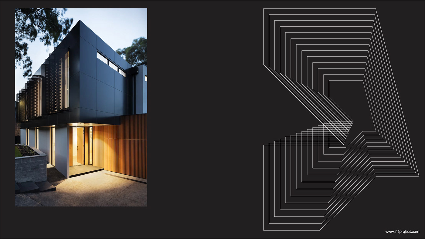
The construction of the logo represents the contours of the building and the letter A. The identity reflects the firm’s modern, open and responsive design process with a graphic language that is accessible and inclusive. Color bring tradition and some nostalgic tone in a positive way, reflecting old way of doing things in a indigo print view.

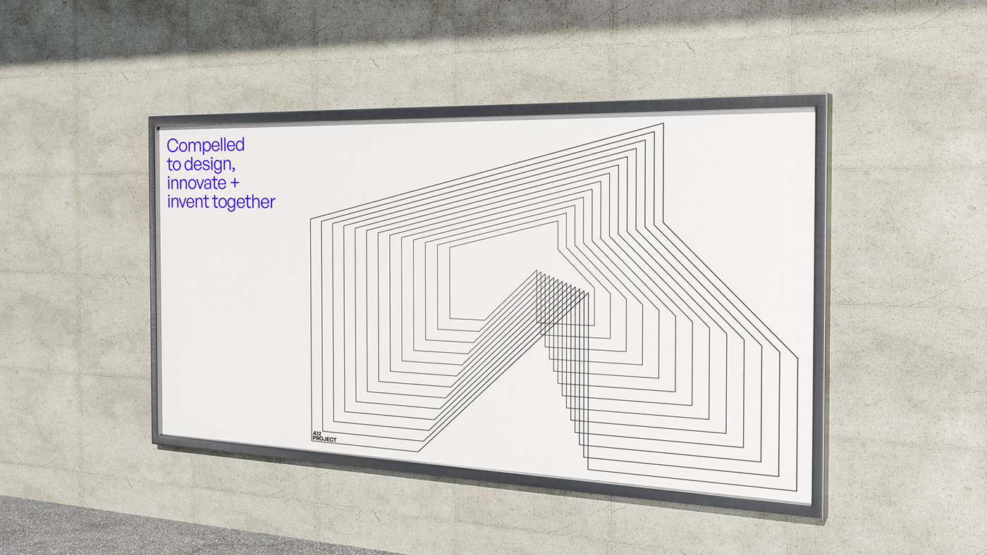
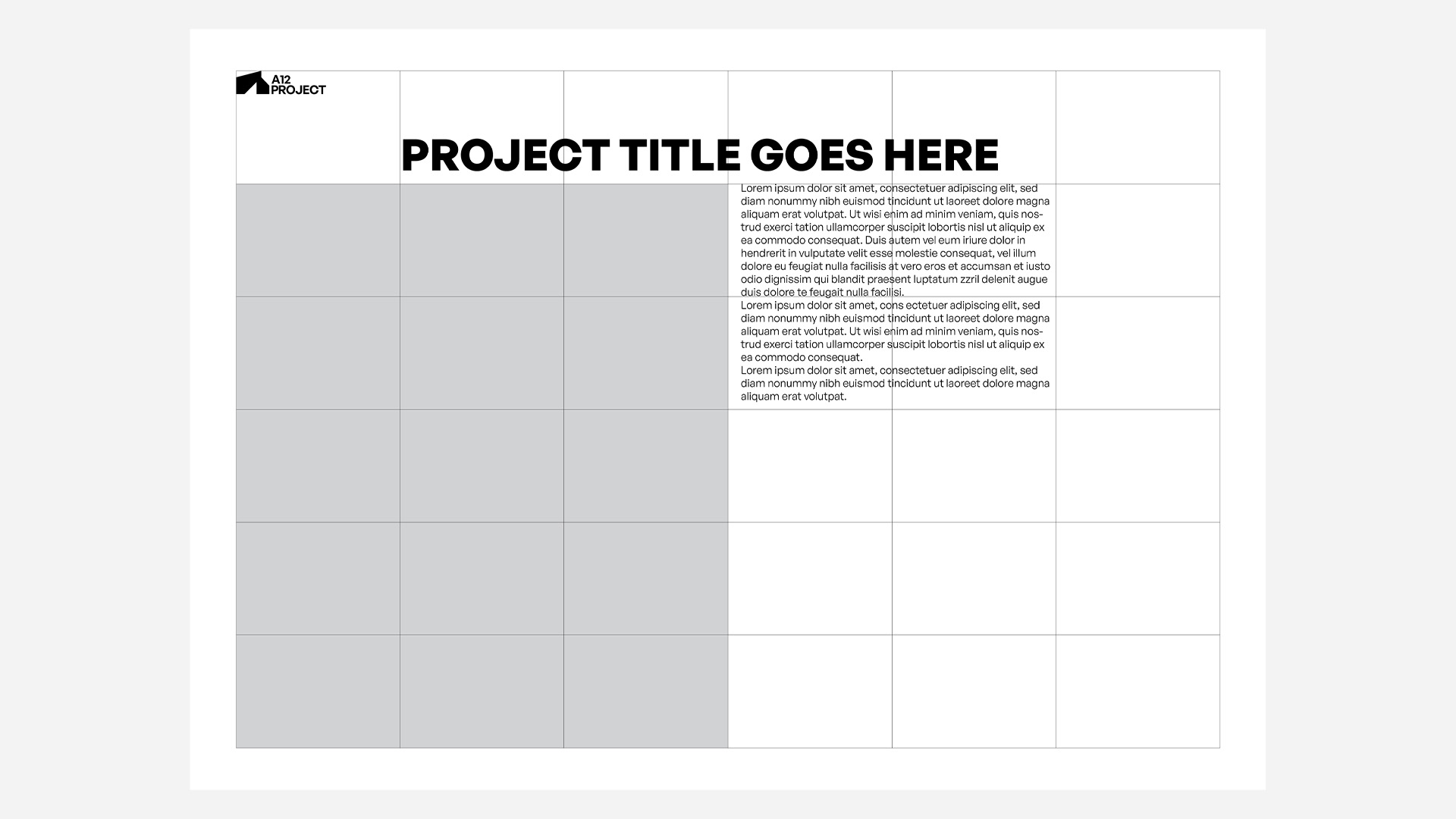
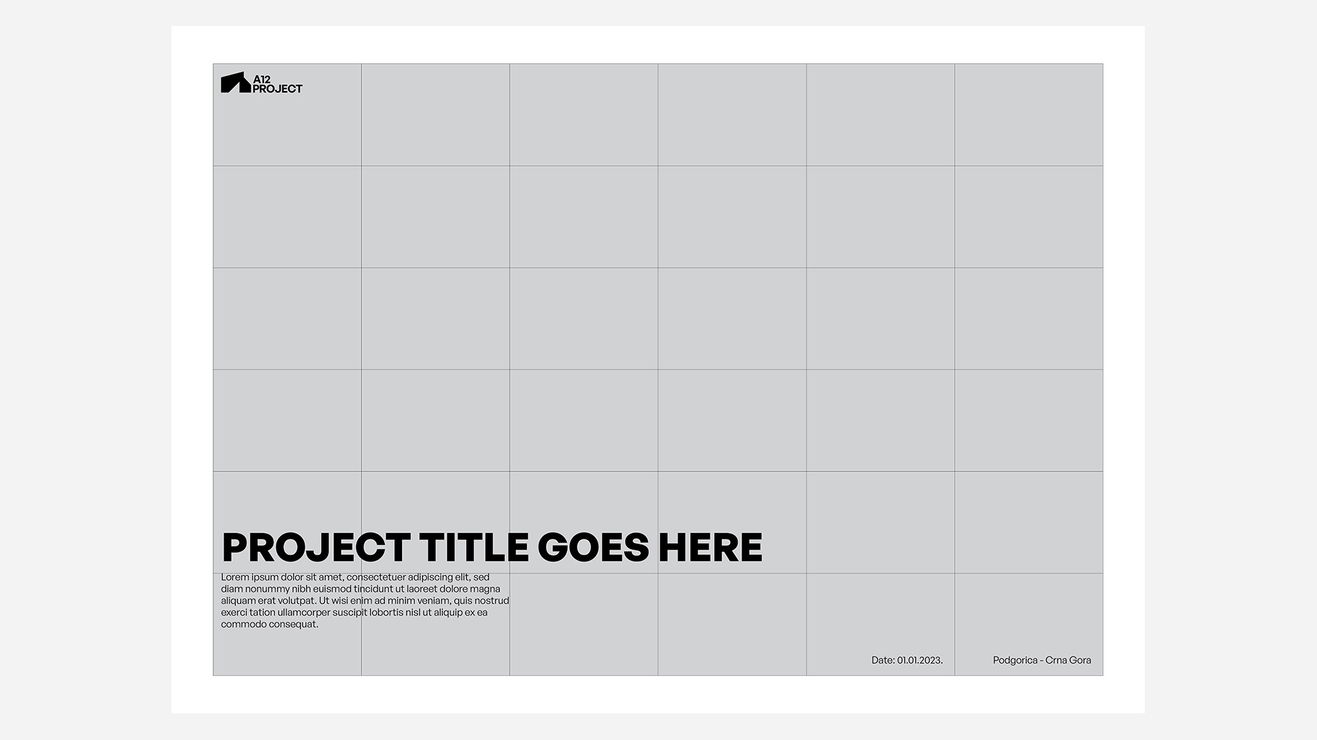
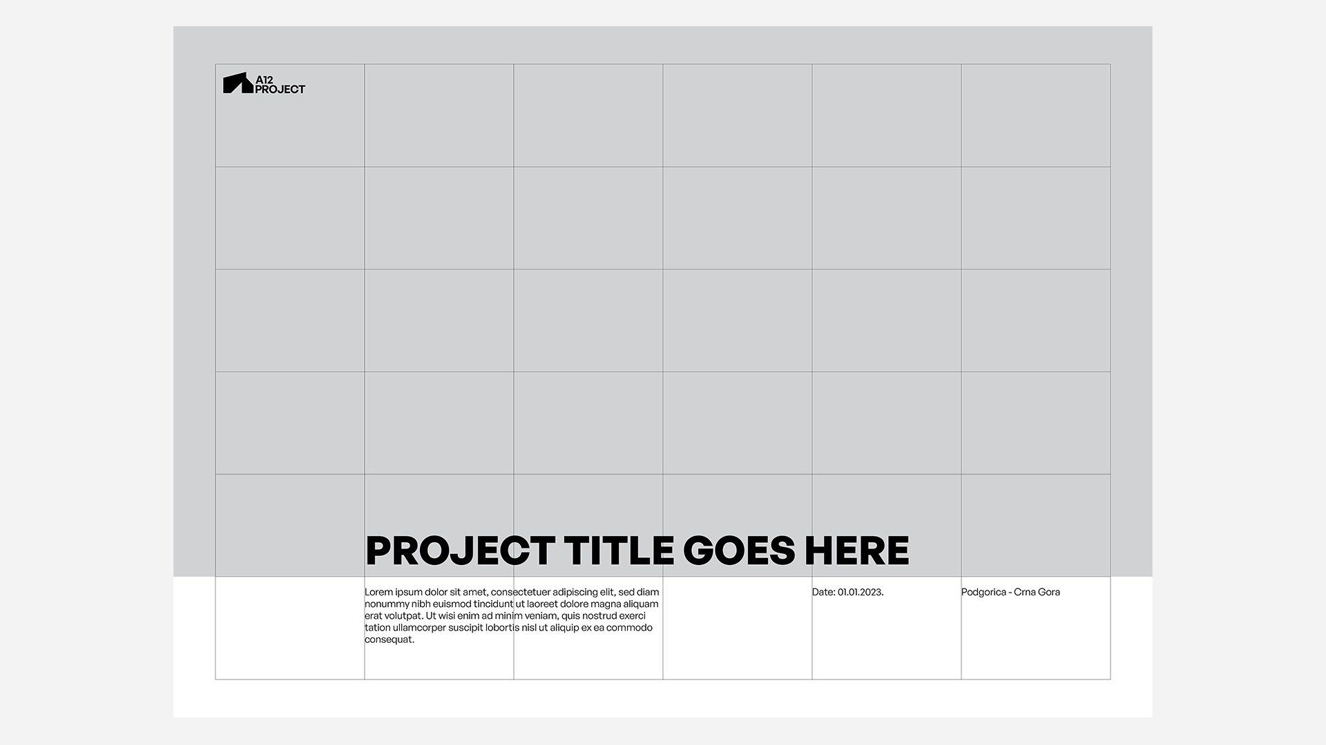
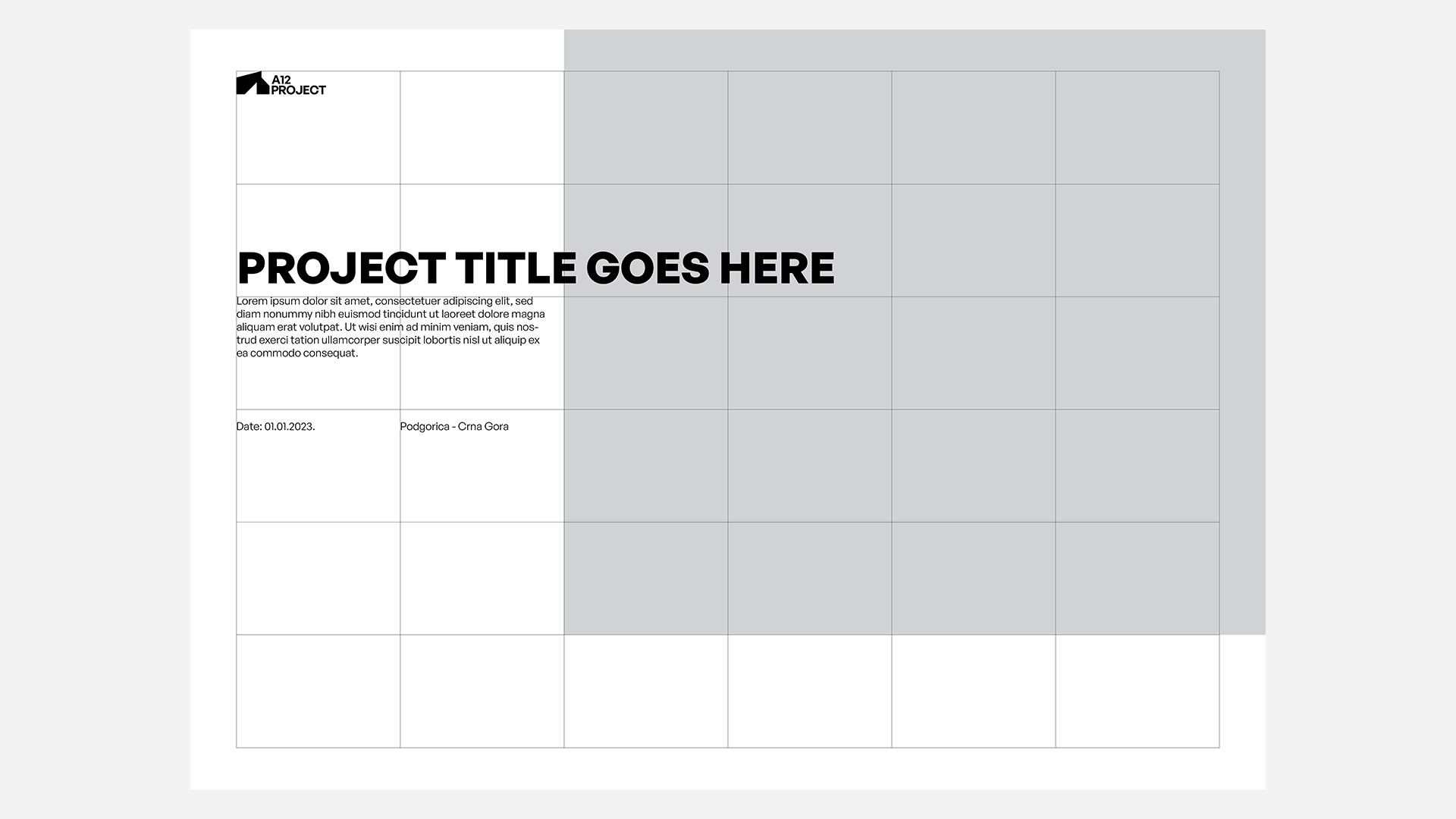
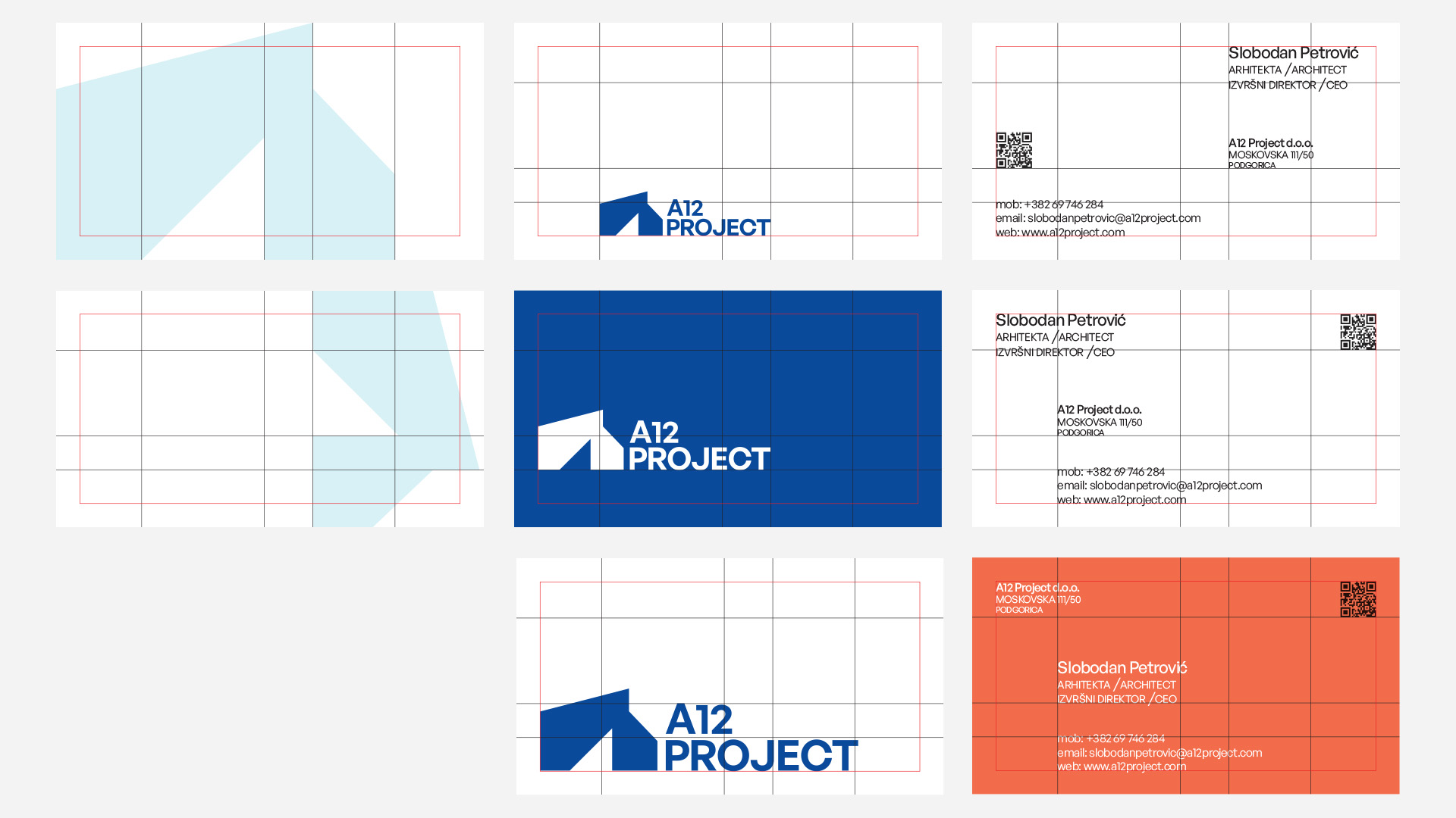
Grid and print
Custom grid its made for a variety of reasons. Layout on the print material must be dynamic, allowing changes when brand needs to comunicate new projects or special events. Same approach its made for business cards, bring variety to the their respective owners.


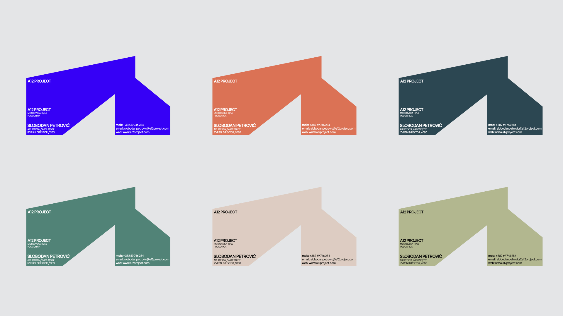
Logomark
Logomark is imagined to stand alone when is needed but must have number 12 included in construction. Here are representaions of color pallete that brand can use. Color pallete is inspired by concrete, construction site and building enviorment.
Logomark can be used as a mask, but full name of the brend must be involved in. Cannot be omitted.
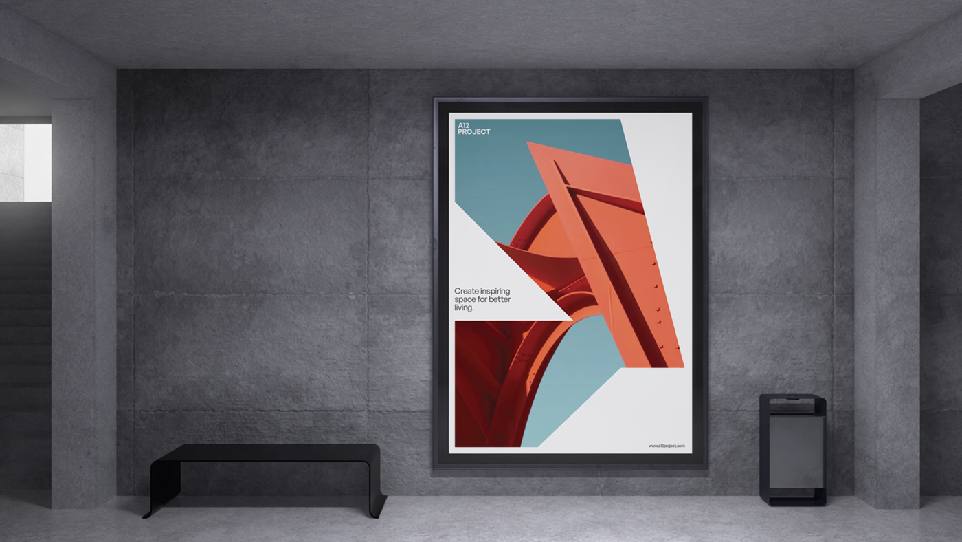
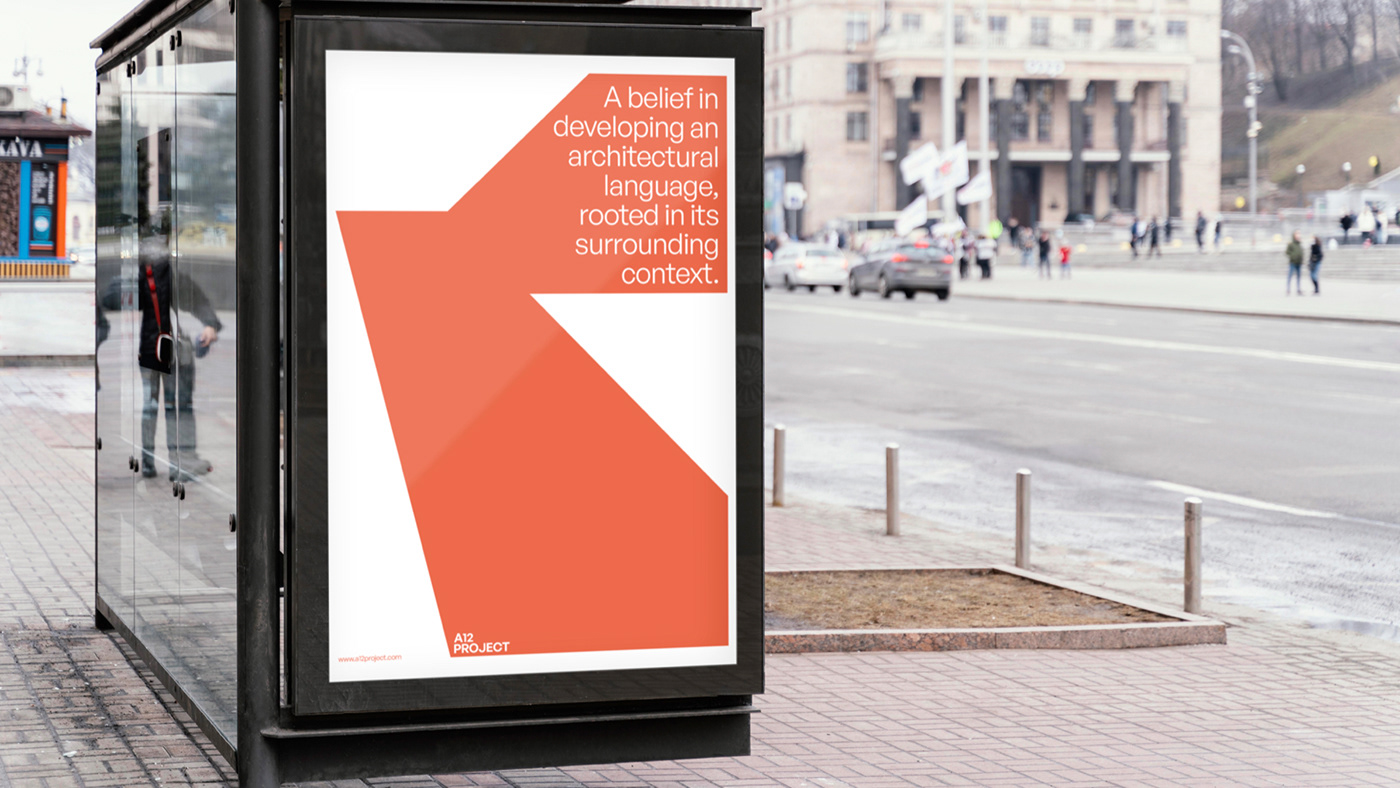

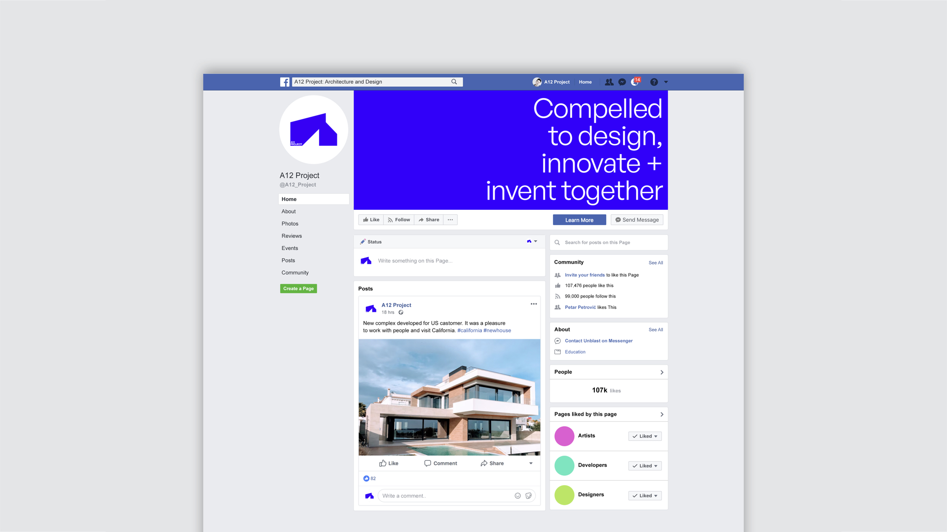
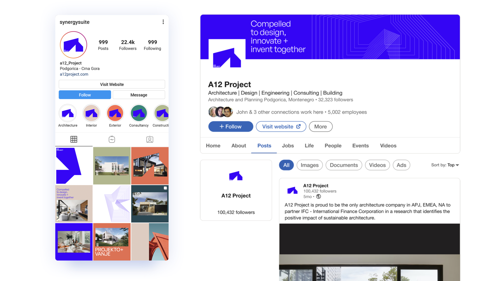
Social media