
Case study
Rebranding
Brand strategy
AltScape
ReportX is a tool intended for people who want an easier way to visualize data and not use advanced BI tools. The tool is web-based, allowing collaboration, and sharing links to the report.
Designed with simplicity in mind, ReportX empowers users to create stunning visualizations quickly and easily, all within a web-based platform that encourages collaboration and sharing.

Simple and easy
User-Friendly Interface: ReportX offers an intuitive user experience, allowing you to focus on your data without getting lost in unnecessary features.
Quick Visualization: With ReportX, creating visualizations is a breeze. Whether you're a data novice or a seasoned analyst, our tool enables you to generate insightful charts and graphs in just a few clicks.
Web-Based Platform: Access your data anytime, anywhere with ReportX's web-based platform. Collaborate with colleagues in real-time and effortlessly share your reports with others via simple links.
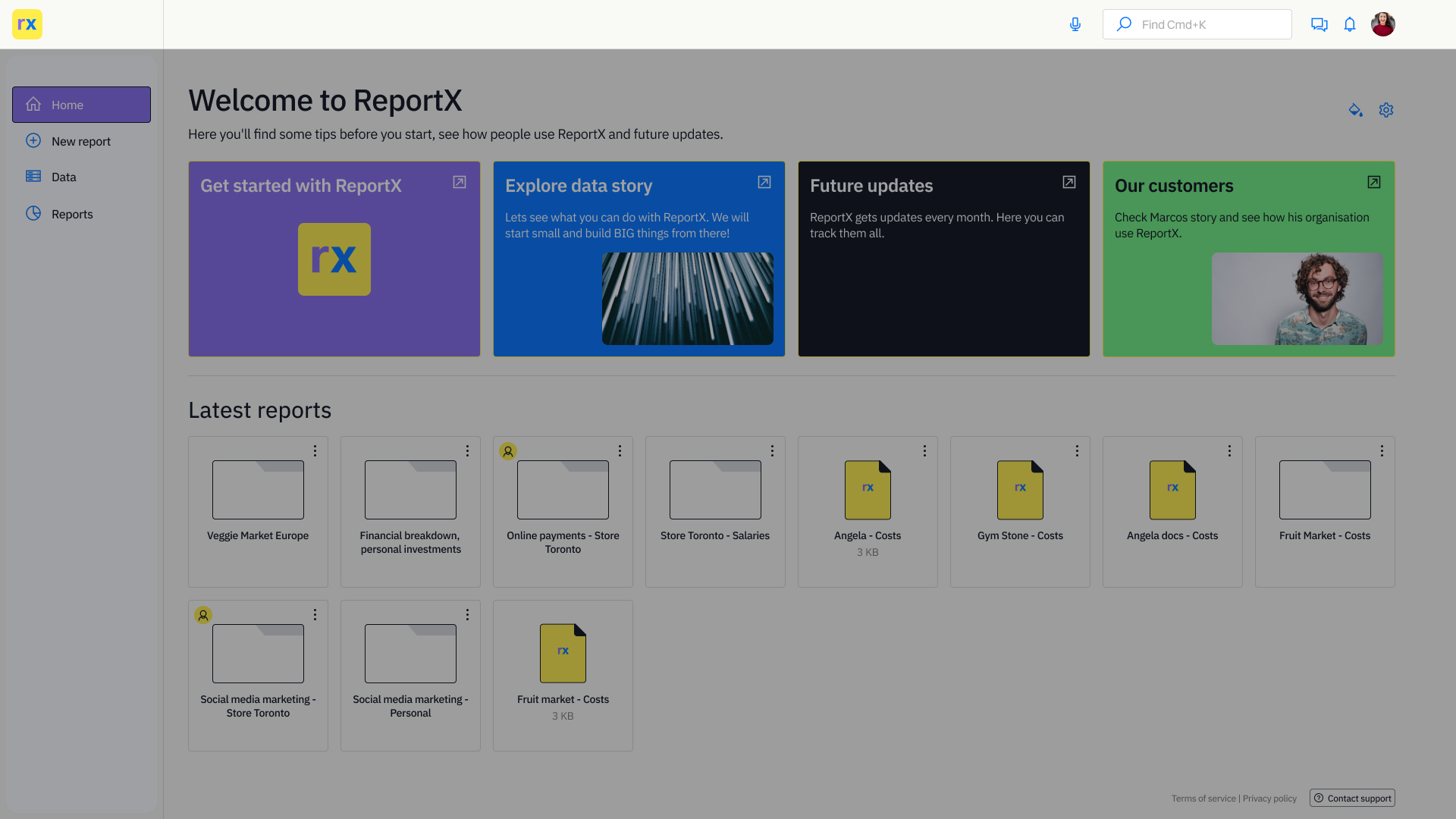
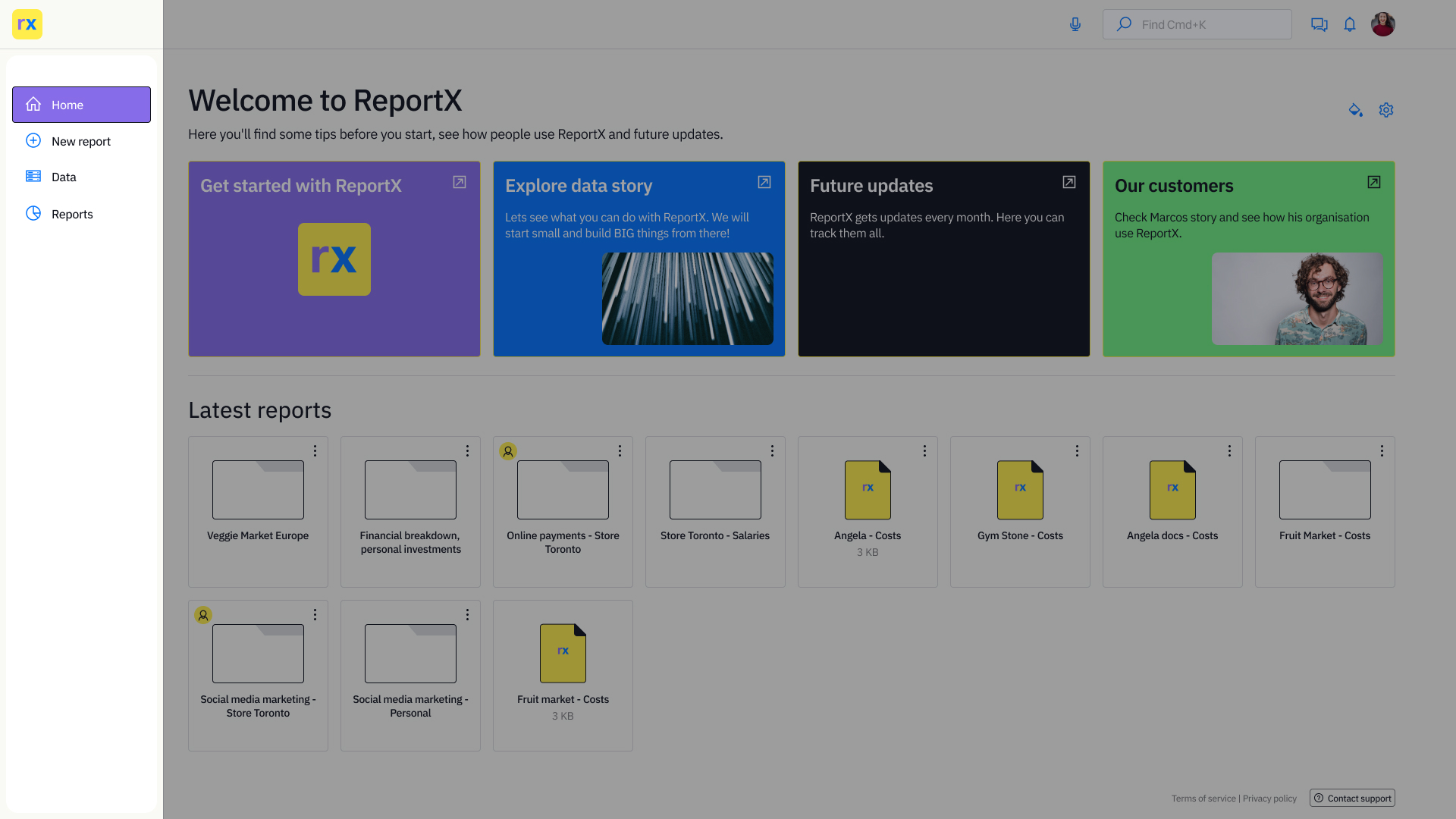
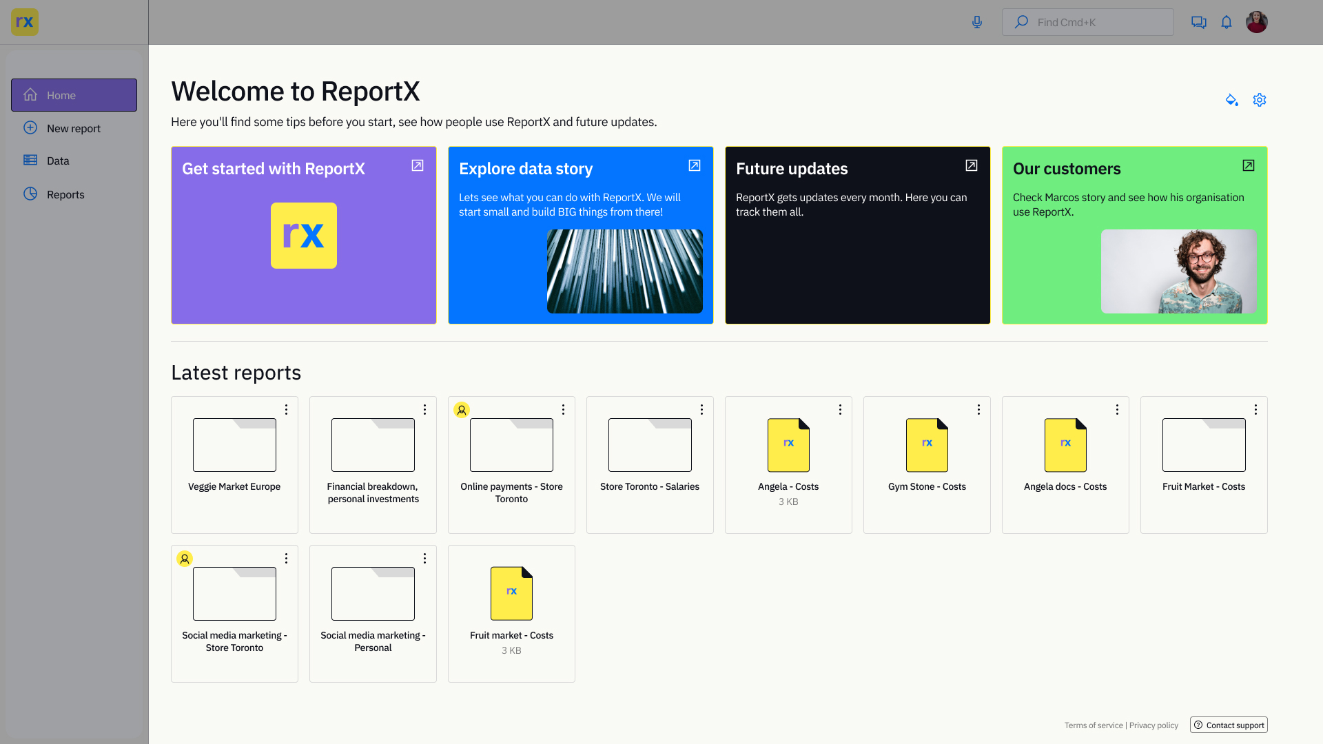
Homepage layout
Header
- Voice Search: Quickly find what you need with voice commands.
- Search Bar: Traditional search functionality for easy navigation.
- Chat: Collaborate seamlessly with team members through instant messaging. Conversation Preview: Stay updated on ongoing collaborations with a preview of conversations.
Sidebar Navigation
- Dashboard: Home base for all your data visualization tasks.
- Files: Organize your projects into folders for easy access.
- Visualizations: View and manage your latest visualizations and works in progress.
- Collaborators: See who's working with you on each file.
- Settings: Customize ReportX to suit your preferences.
Work Area
- Introduction: Learn about ReportX and its features. Can be toggled on or off based on user preference.
- Recent Activity: Track your latest visualizations and works in progress. Easily identify which files have collaborators.
- Folder Organization: Group your files into folders for better organization and efficiency.
- Minimized Sidebar: Maximize your workspace by collapsing the sidebar when not needed. Easily expand it again whenever necessary.
ReportX offers a streamlined experience for data visualization, combining powerful features with intuitive design to enhance your productivity. Dive in and discover the possibilities with ReportX today!
Creating the report with data import
Before diving into data importing and report creation here is the user flow, chart diagram showing paths that users will take to complete the task.
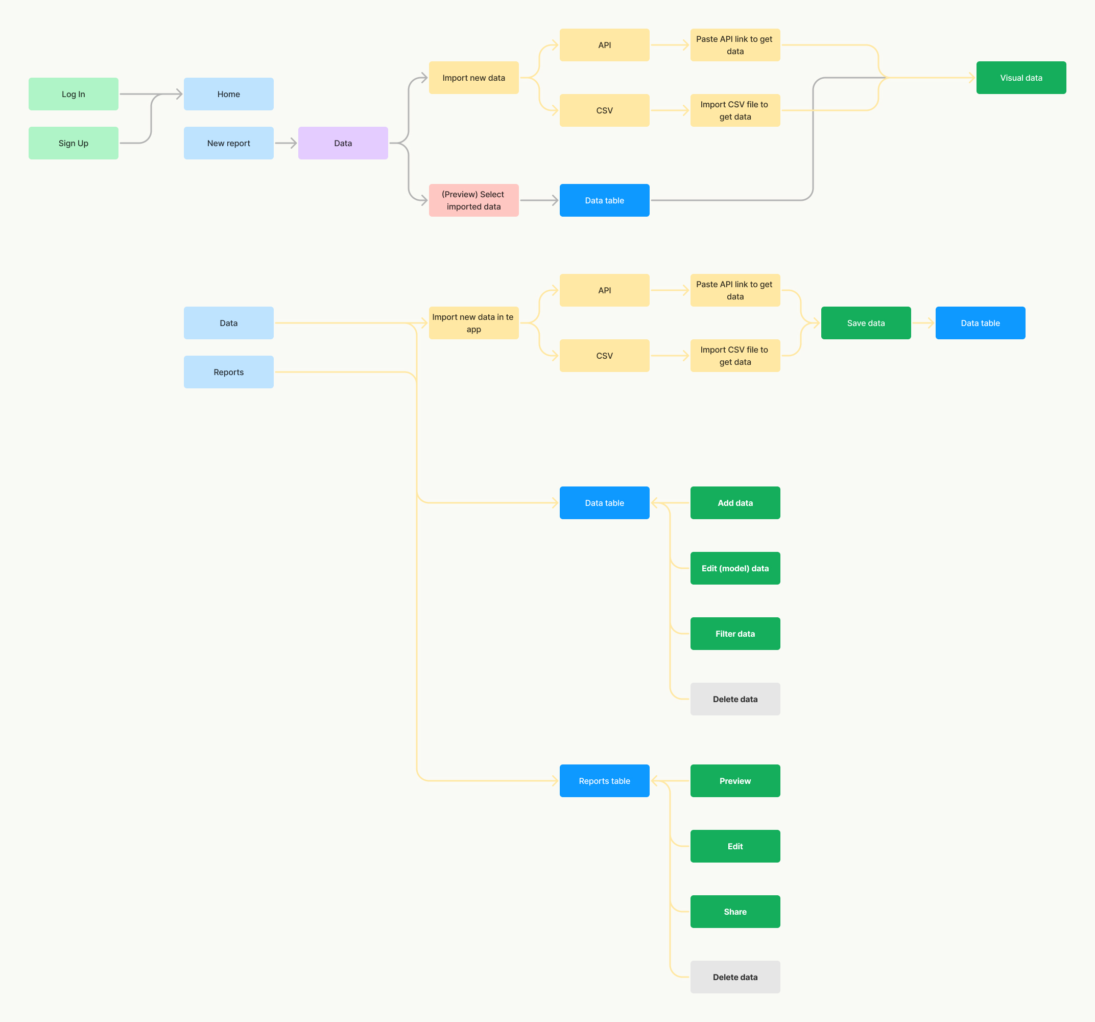
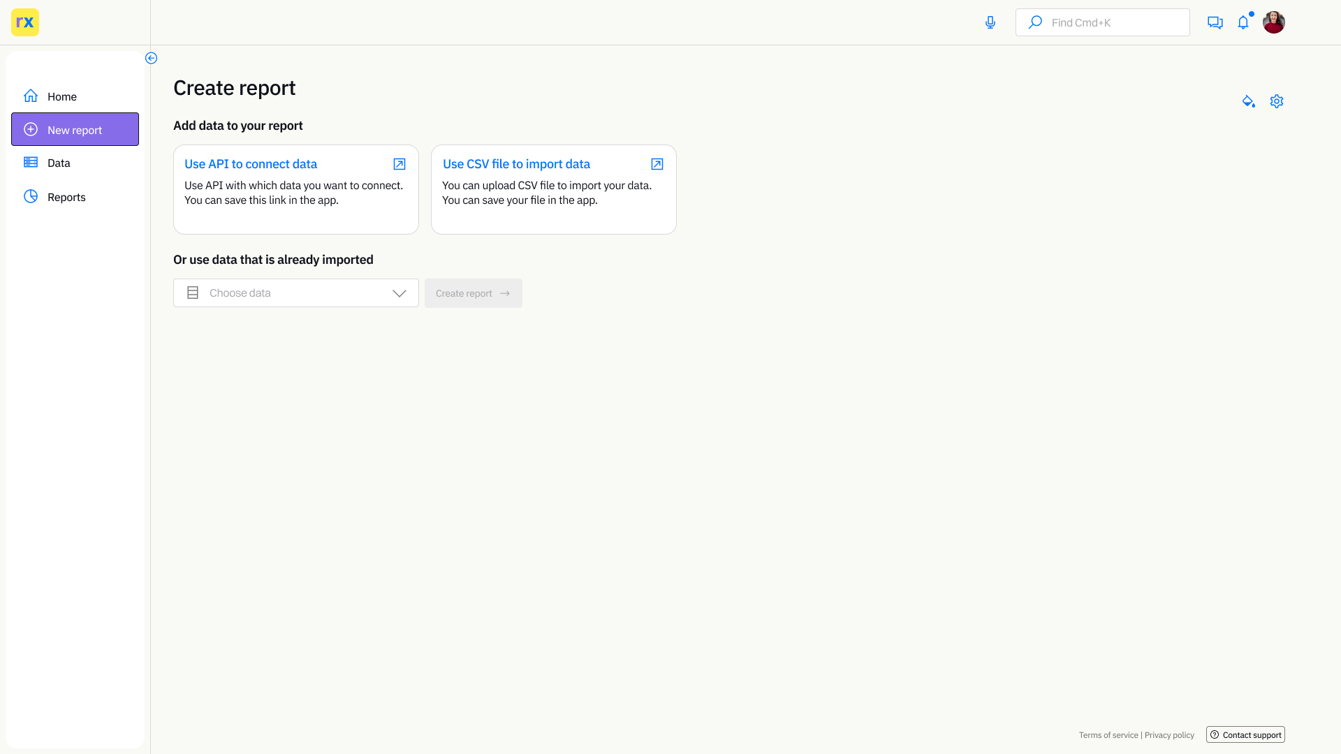
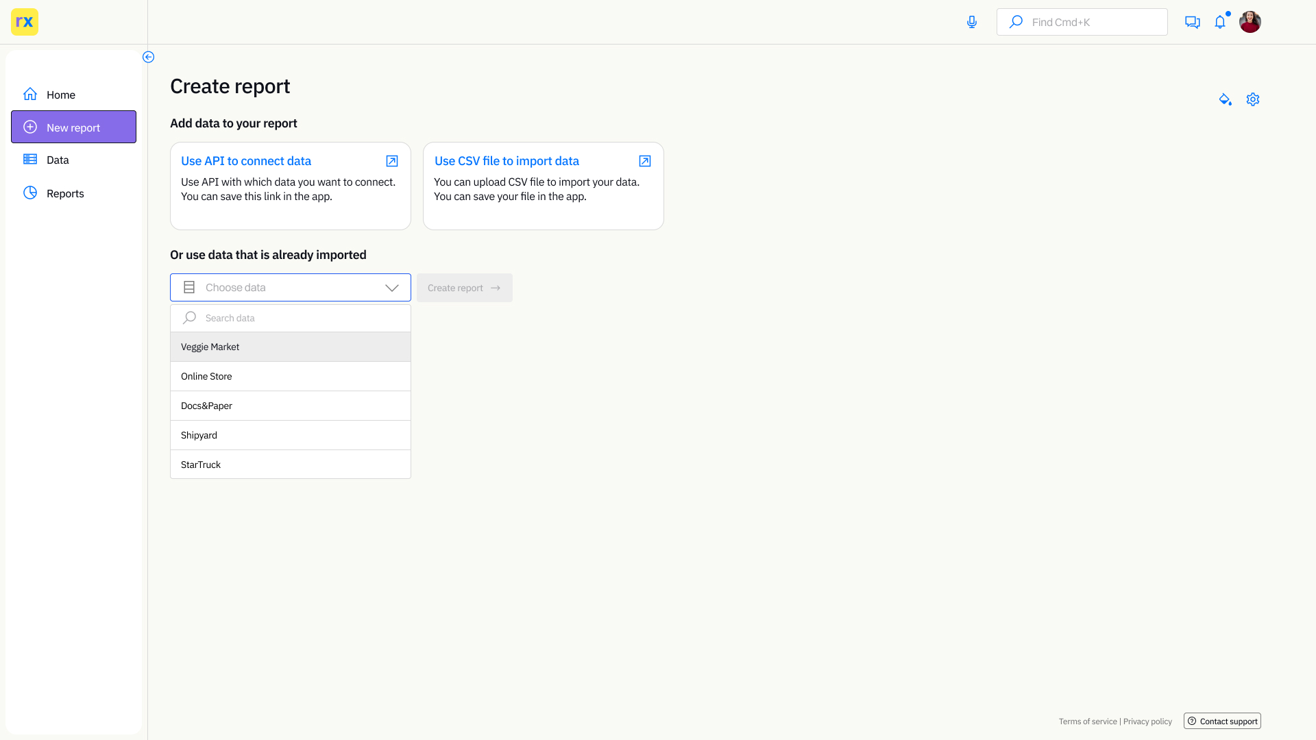
For creating a report(s) user has two different flows to choose from. First, when they want to create a report with new data that is not in the app already. They can connect API or import CSV file(s) or they can choose from the data that is already imported into the system.
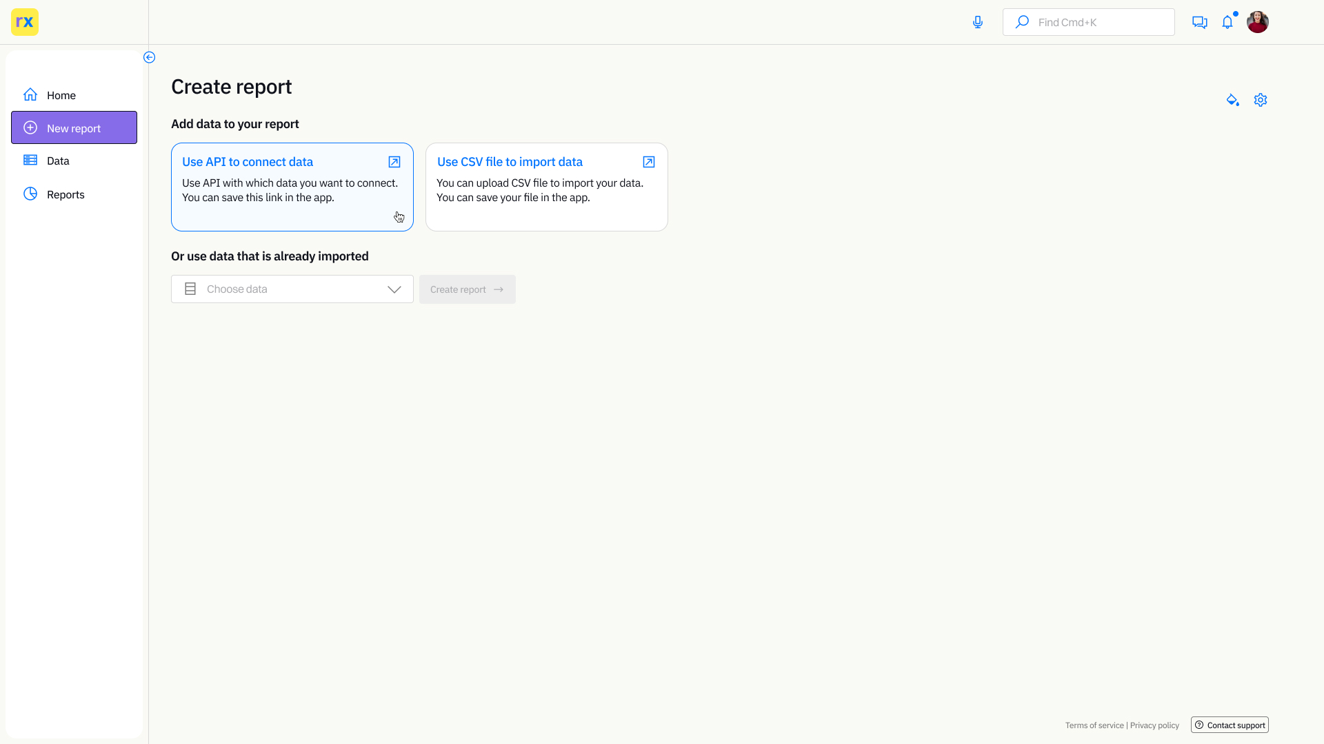
Both options are on the page, to avoid going to the data page and importing it, and after that go to the New report page to continue the process of creating the report.
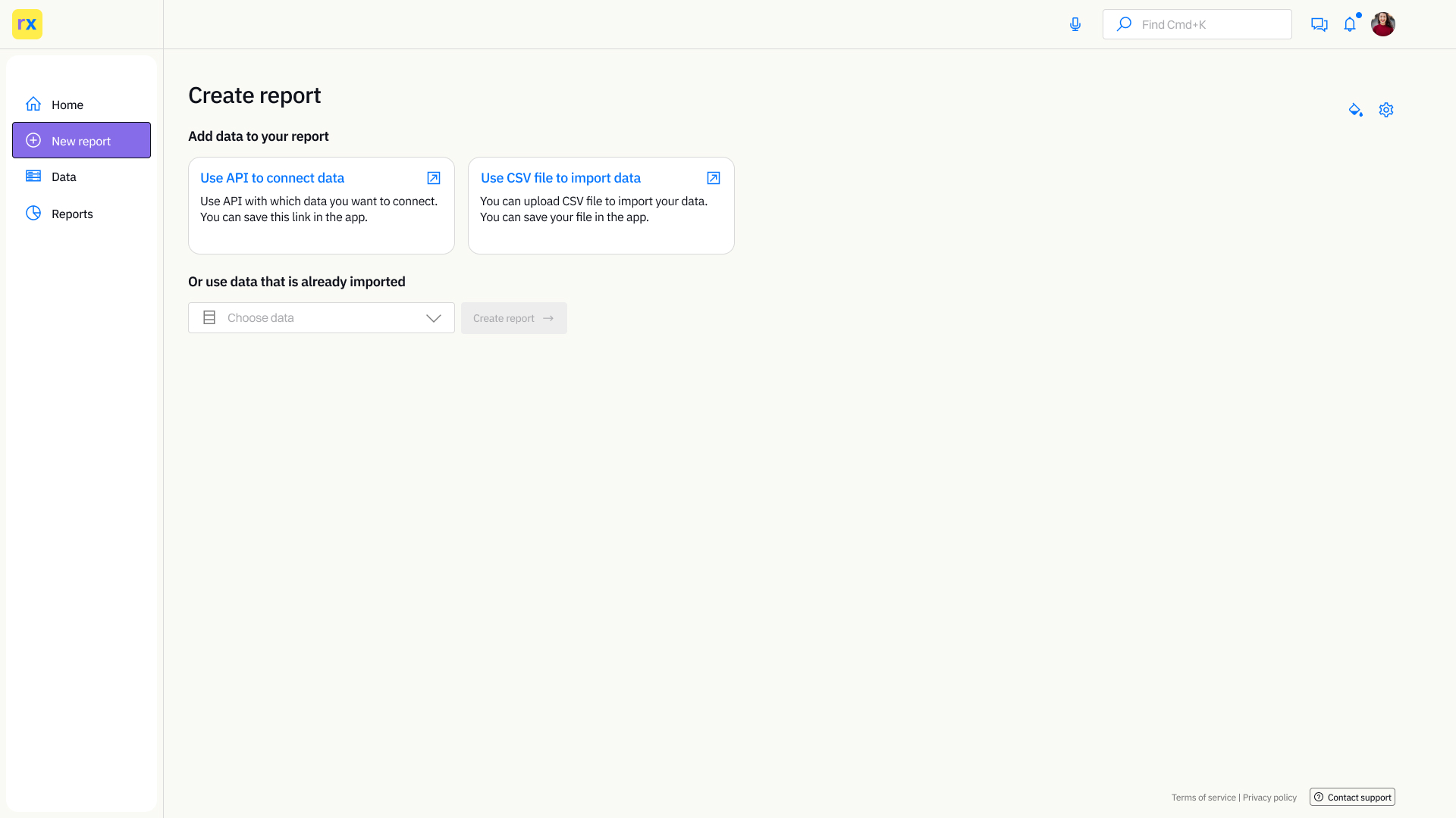
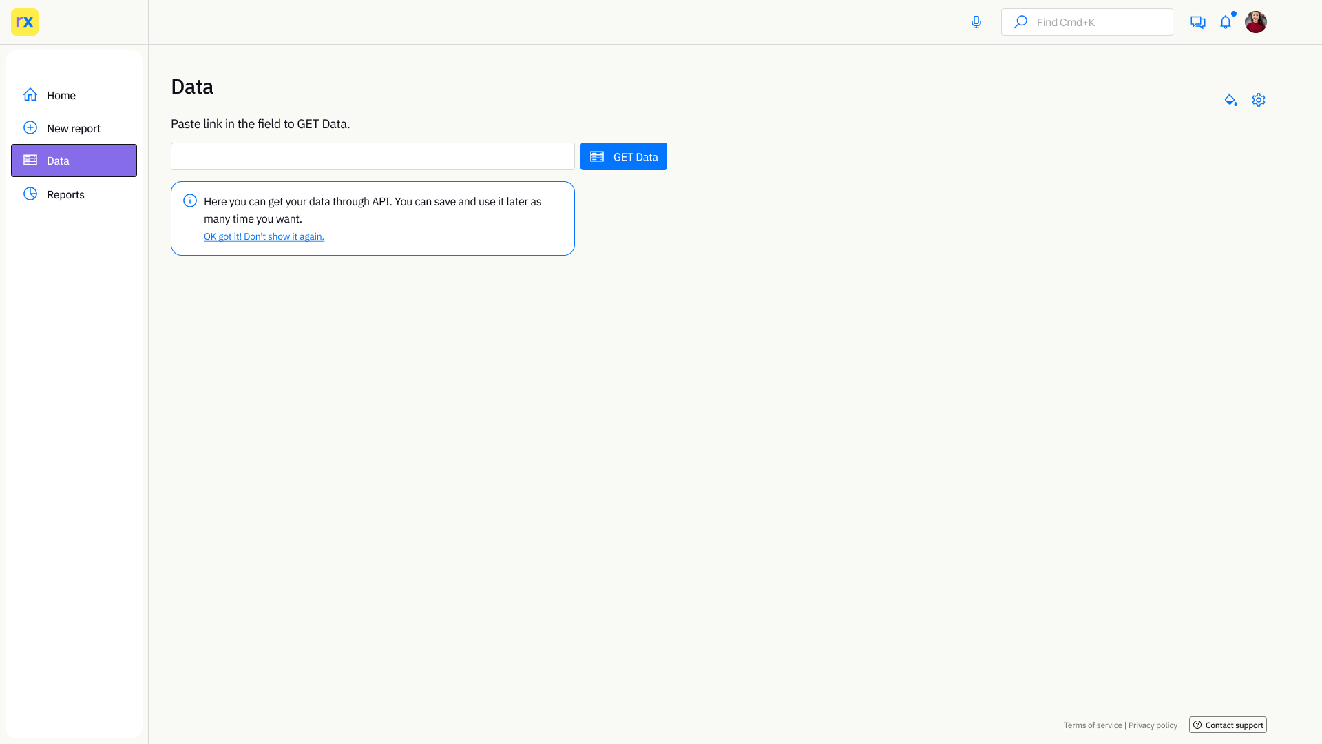
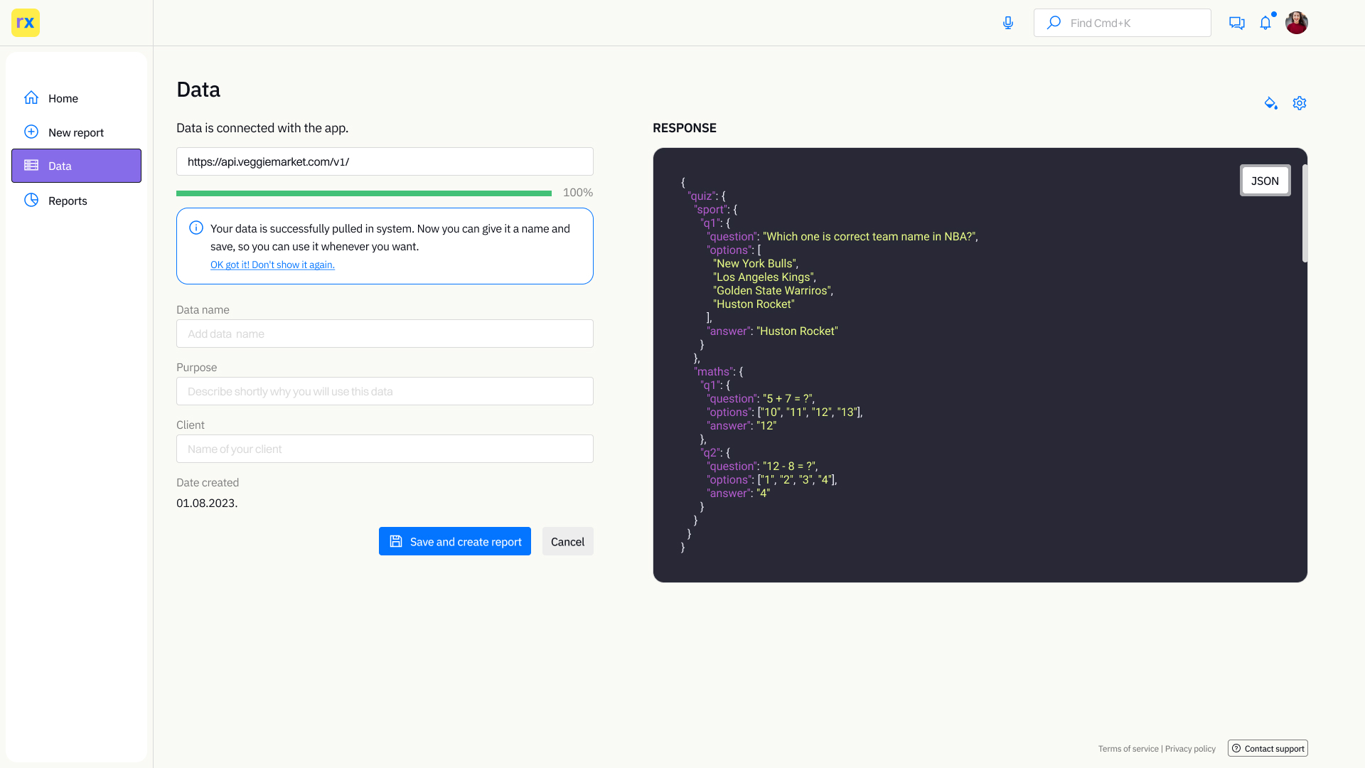
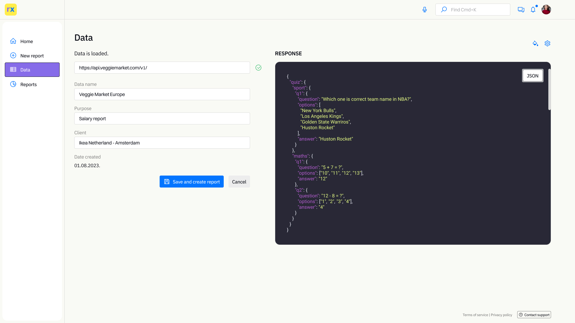
First, we will cover import data through API. This process should be relatively easy for the users, copy and paste the API link and give a name to the data.
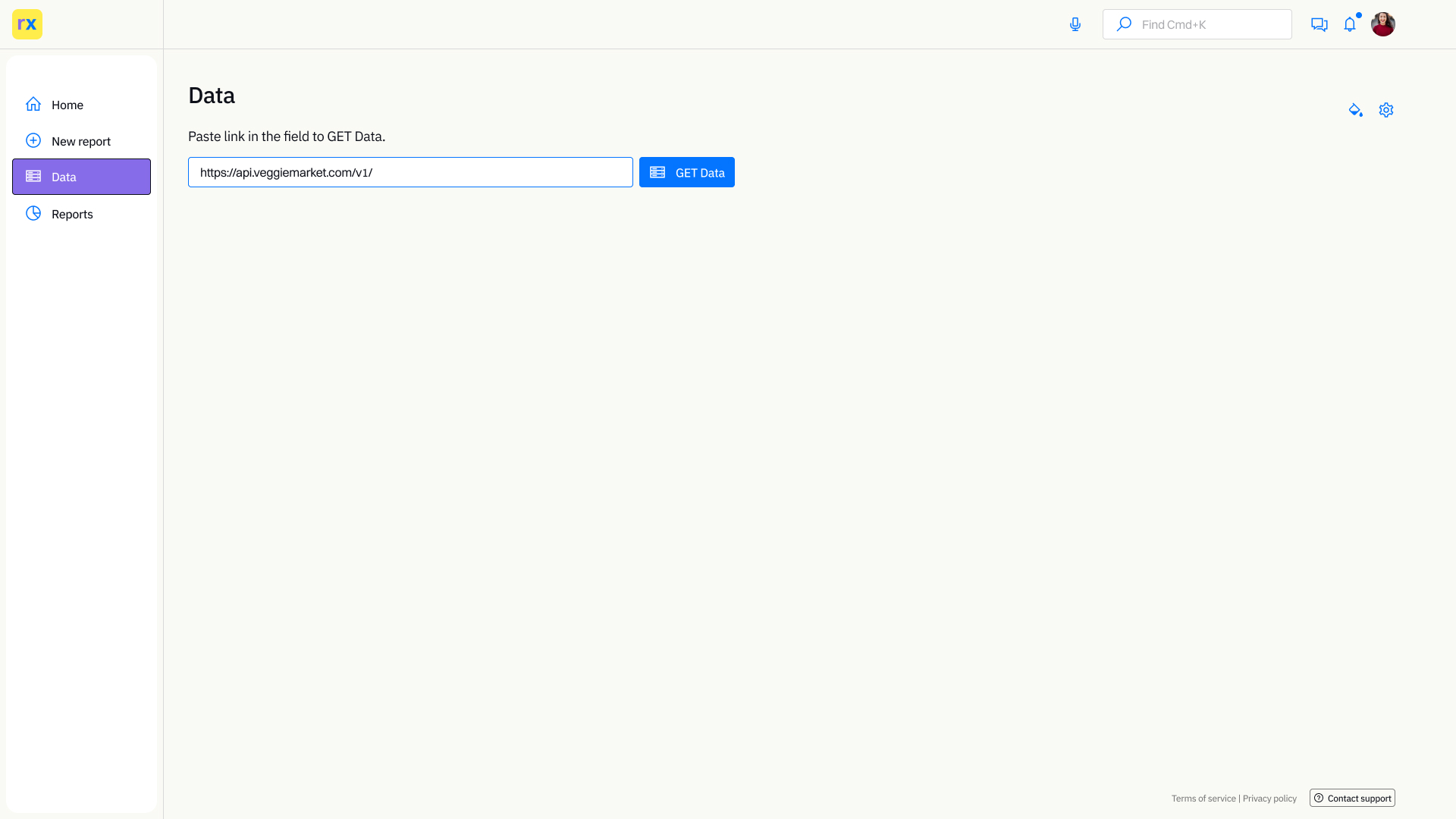
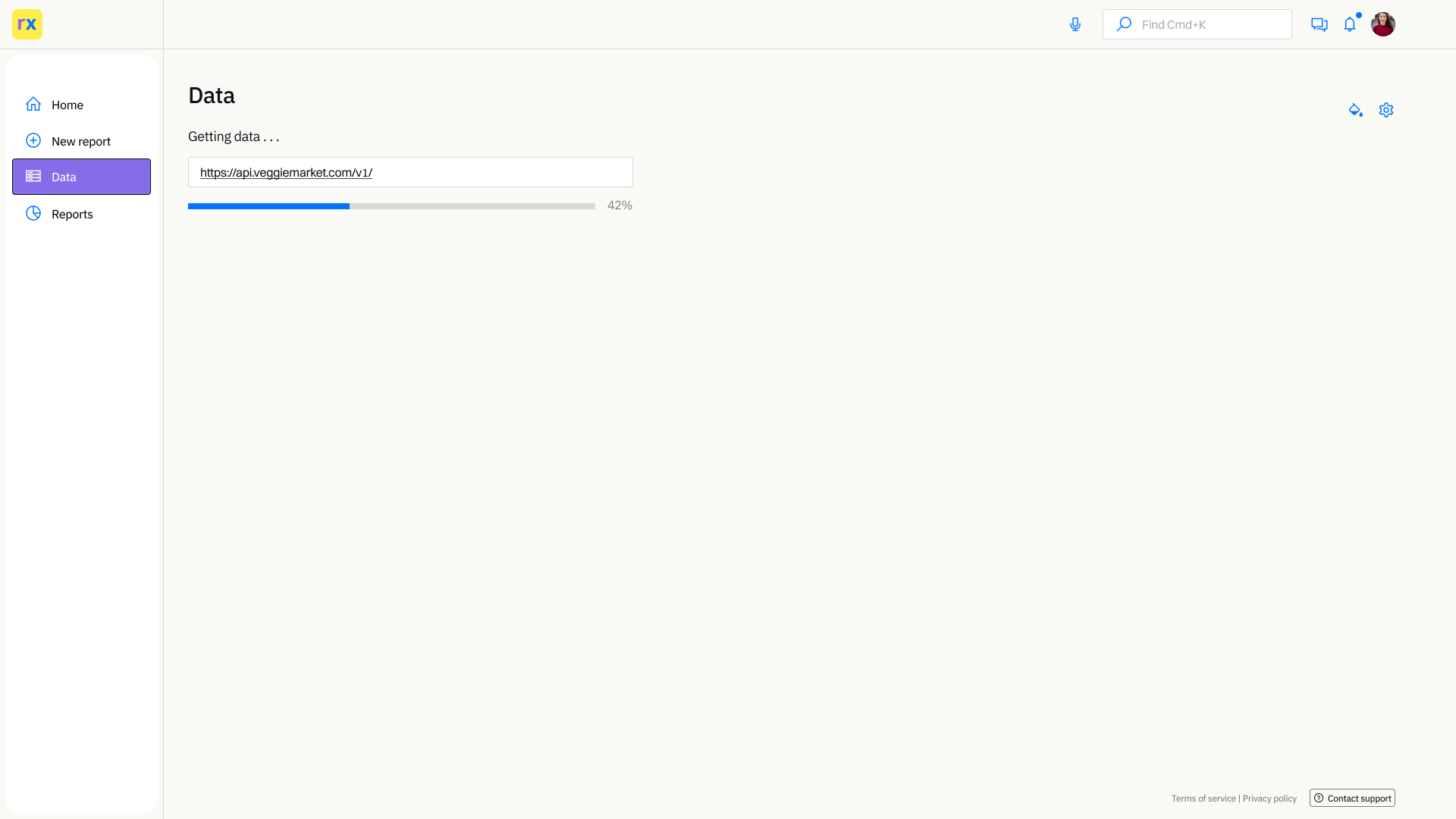
App provides a preview of the JSON file but in this version can't be edited. Users have fields where they can enter data purposes, for what data should be used, what kind of report, and the client name. To easily sort later and put in one place, a folder, for specific clients. After that users can create a report immediately.
Creating a report with data already imported
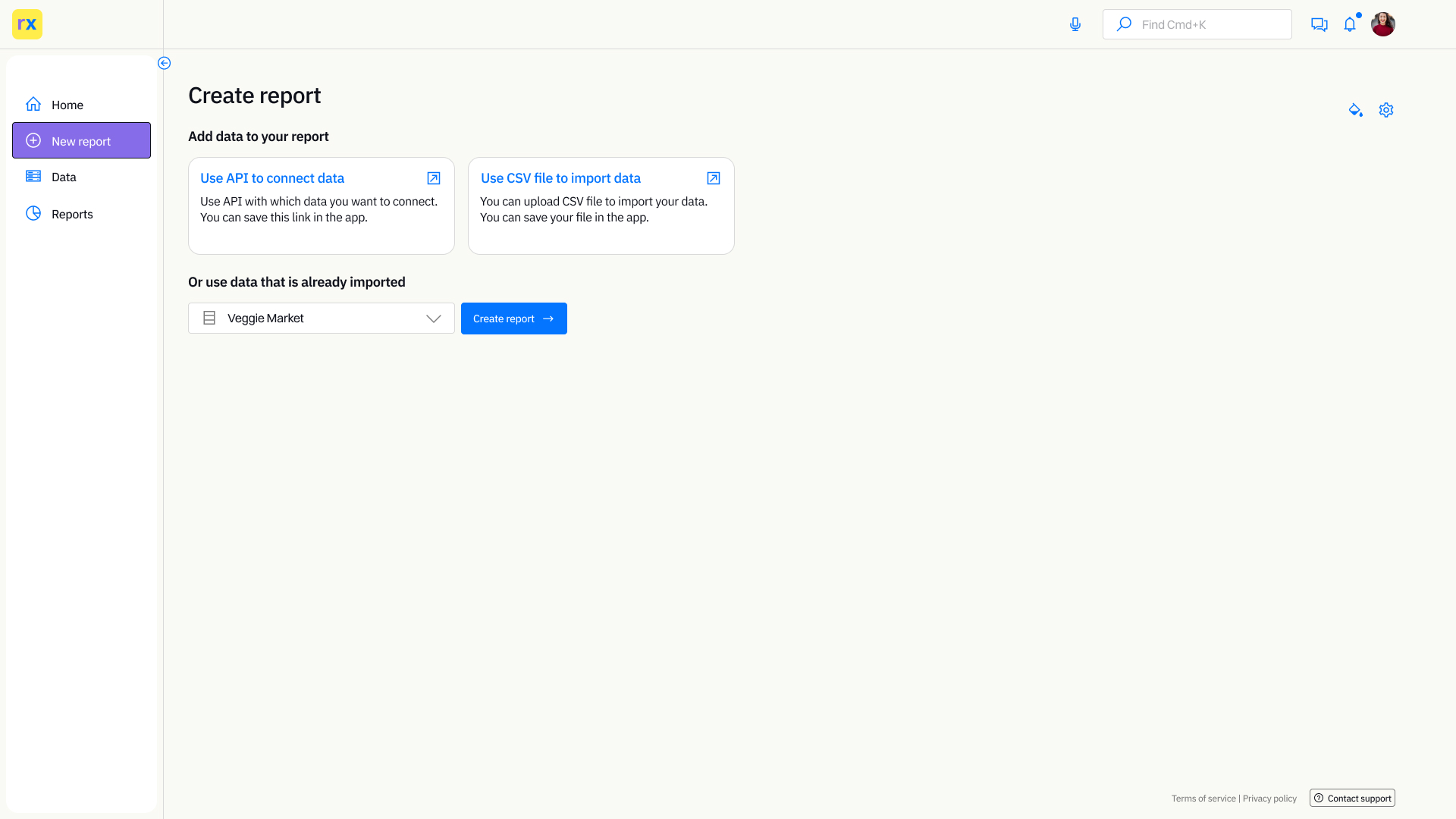
Creating a report with data already imported data is a very simple process. Users just need to pick one of the data sources that are already in the app.
Grid and data visualisation
The main feature of the app is data visualization. To be easy to use, the grid must be flexible and allow users different possibilities. This will provide easier organization of the chart elements on the page and choose what data needs to be presented in different charts.
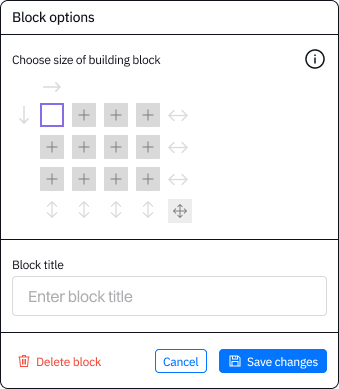
ReportX has a simple block builder. The page is divided into 12 squares, 4 in 3 rows.
These squares are a major building block of the report. One square could be one chart. Users can group squares in bigger shapes that will serve for chart presentation.
Grouping can be done horizontally and vertically. Also, there is an option to group all squares so the whole page will be charted. Users can give a title to the square or a shape to easily navigate later on if they need to change something, and there is an option to delete the block.
In the prototype below, you can see how the grid should work.
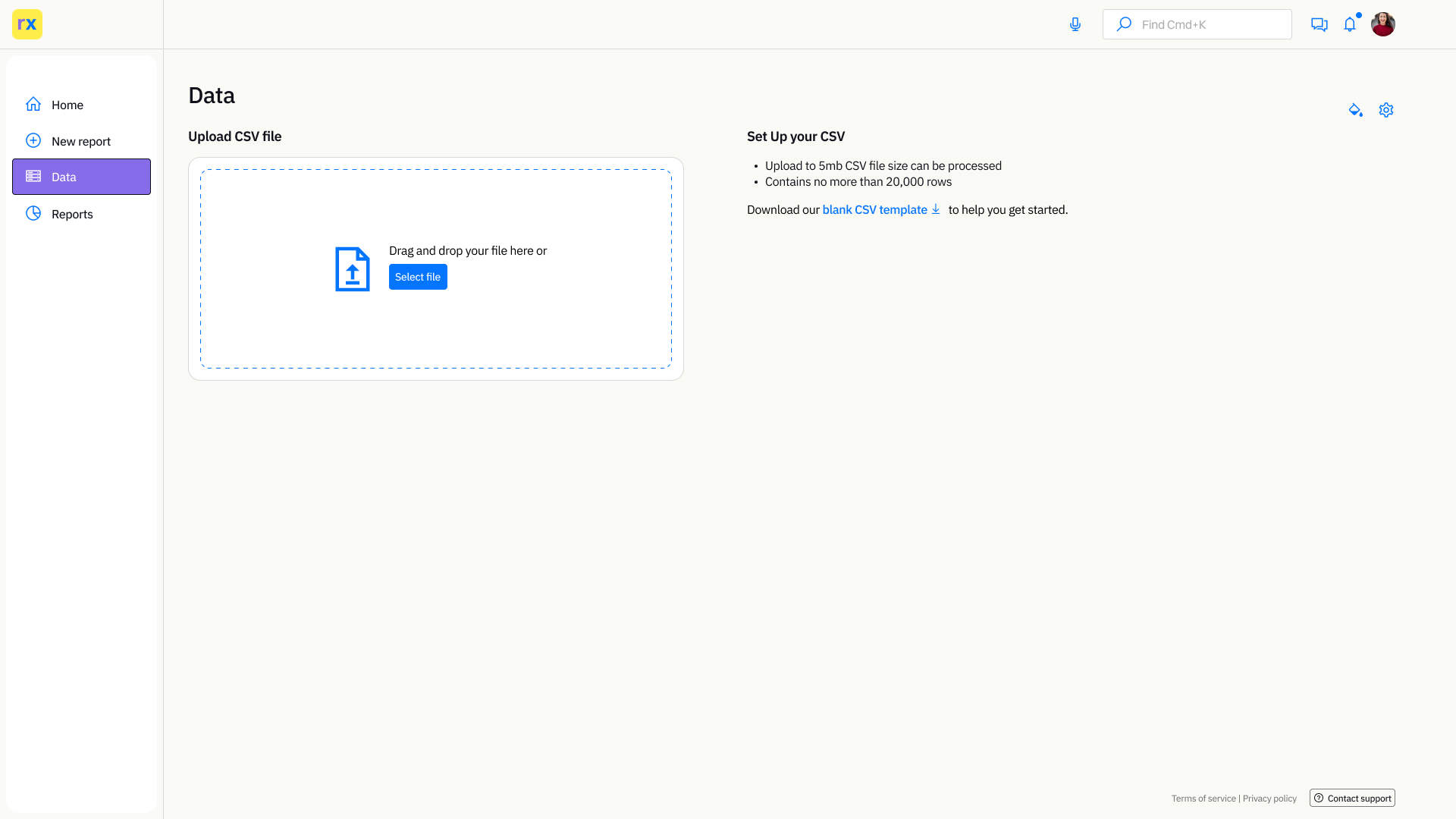
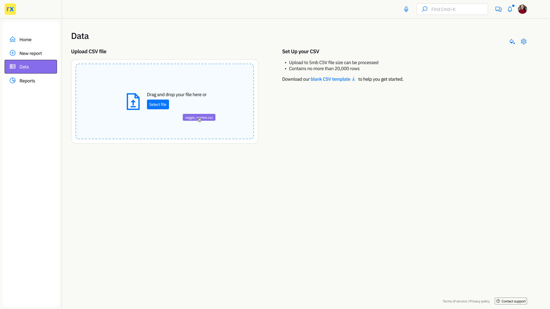
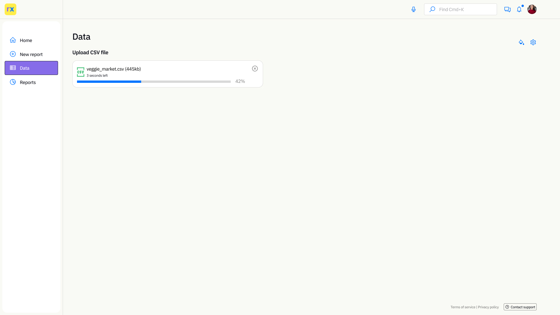
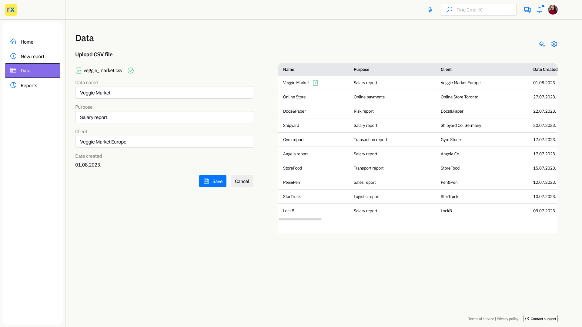
Import data with CSV files
Users have the option to import data through CSV files or connect sheets online. This can be very helpful especially when it comes to collaboration with clients. Users can import one or multiple files.
Dashboard - Creating visualization
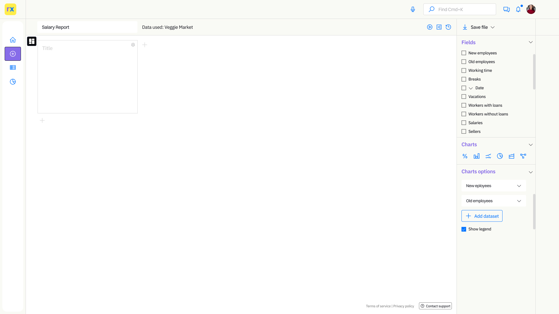
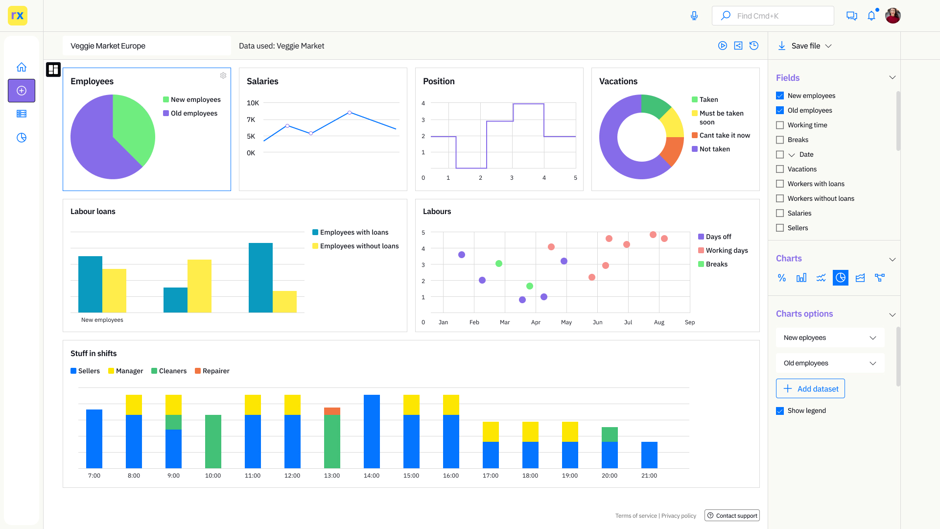
Here is an example of a dashboard, the main feature of the app. In the example previous you can see how the grid is created and manipulated. The approach to chart design is also very minimalistic and simple, allowing users to understand visualized data if they have little experience with that.
The share option is for clients where they can see reports especially when live data is included. Working with live data is the option that will be integrated in the future. Also, there will be the option to include a custom domain for live data.
History of changes can be very important and give flexibility to work with visualization.
On the right sidebar are the options for charts. Users have the option to choose data types and how they want them to display.
This project is still in progress in the future page will be updated with new information.
I write regarding dashboard design here. If you have time take a look.